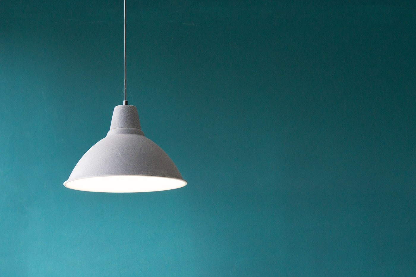
Light as a guide
Here lighting is more than illumination. It guides the eye through the space. Bright focal points and quiet surfaces create a clear hierarchy.
Documenting the project
The gallery, cover image and captions each explain one design choice. The story can evolve through the media manager without rebuilding the page.
On first entering the room, the eye finds the pendant and then rests on the work surface. That sequence is deliberate. Brightness, distance and surface texture were balanced so the space feels striking in a photograph and comfortable in daily use.
From the wide shot to a tangible detail
A full-room image explains where everything sits. The finer decisions live elsewhere: the cable route, direction of light, grain of the table and the shadow on the wall. Every gallery image has a short caption and credit so a visitor can understand what the picture is showing and who made it.
For phones, we chose crops that keep the subject in frame. Alternative text describes the image rather than repeating a filename. The visual story should still make sense when someone cannot see every photograph.
A good gallery is not a stack of attractive images. Their order should reveal the decisions behind the work.
A project after publication
When another photograph arrives, the page does not need rebuilding. An editor can change media, cover, captions and order in the CMS. Moderated comments keep the conversation open without sacrificing the quality of the public space.
Gallery comments