Imagine a new client opening your site on a phone between meetings. A strong photograph earns a glance, but it cannot carry the whole conversation. The visitor needs a clear headline, evidence they can inspect and an obvious next step. That brief encounter is where we started designing this experience.
Before choosing colors or motion, we wrote down the questions a visitor might ask. What does this studio make? Where can I see the work? How do I ask about a detail? Can I test the shopping journey? Each answer needed a home in the information architecture, not another generic card on a crowded landing page.
Give every page a specific promise
The home page introduces the whole experience. Selected work pairs visual evidence with the decisions behind it. The journal makes room to explain process. The demo shop presents price, availability, offers and delivery options in the order a customer needs them. These pages share an identity, but they do different jobs and should not look interchangeable.
That difference is why a gallery has captions and image credits, an article has a readable hierarchy and related stories, and a product has search and comparison tools. The CMS keeps these pieces editable without forcing every kind of content into the same composition.
Good design is not only impressive on the first screen. It keeps the path clear after the third click.
Content needs enough weight to test a design
Two lines of placeholder copy cannot reveal whether a journal layout is comfortable to read. Real paragraphs wrap differently. A subheading creates a pause. A quotation changes the cadence. This story deliberately includes all of them so the reading column, spacing and mobile treatment can be judged with plausible material.
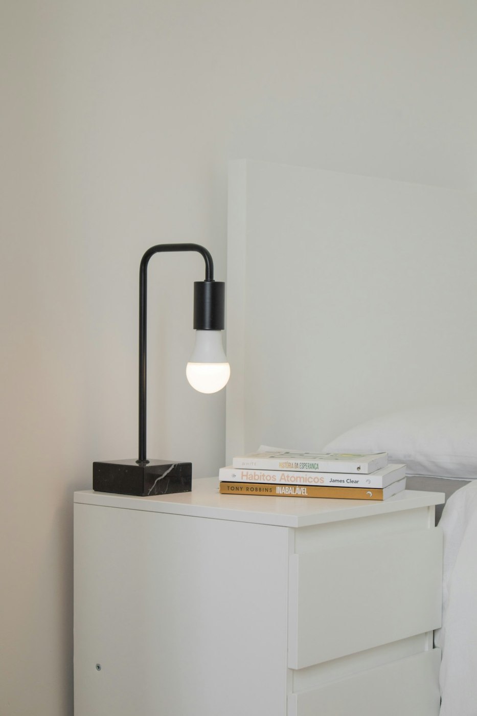
The worktable cover is part of the story rather than a decorative fill: useful digital work is made from many small decisions. The same principle carries into the galleries, where a title, alternative text and caption help an image remain meaningful even when the visual context changes.
Three checks before publishing
- Can someone tell why the page matters from its heading and lead?
- Do the image, body and next action support the same subject?
- Does it remain readable on a phone with long text and imperfect imagery?
Make the next action part of the story
The experience does not end at the final paragraph. A reader can open a related article, leave a moderated comment or send a question through the contact form. Those forms connect to the CMS; they are working parts of a conversation rather than static decoration.
The sample shop continues that journey. Visitors can search, save products, compare alternatives and explore an order with demo-only payment data. Each tool appears where it helps a decision, while typography, color and guidance keep the overall experience coherent.
What should remain with the visitor
This demo is not simply a count of modules. It shows how an idea becomes a connected experience: a story worth reading, media that explains something, interaction that receives a response and a purchase path whose state is understandable. If someone can move through it without a presenter, the design has done its real work.
Gallery comments